There is the Barbican and then there's everywhere else; Auction Observer 095
London's massive estate is the last of its kind... and a masterpiece
Whassup y’all…
Housekeeping:
Auctions Observed down below—and as there are too many auctions every week to fit into an email, many of the best ones can be found in the Substack chat:
If you pay, check it out, lots of volume in there. Click on the pic for a link to the chat. It’s in app or web. This newsletter’s MO, for new readers, is to expose the breadth and depth and excitement of design through real items… pieces that are special and attainable (sometimes both, sometimes one), which have a story and which smart normal people will like…
Congratulations to Snake Q&A 016 Respondent Kathleen Sorbara on the opening of her namesake boutique in Williamsburg. In Sunday’s Times piece about the opening, she said, “we are going after the 36-waist pants guy”—those are dirty bulk numbers. That ain’t me but it’s nice to hear—so much of the best vintage is for tiny waists… here is to style being less sequestered. Read Kathleen’s interview:
Snake Q&A 016: Kathleen Sorbara/Chickees Vintage
·Now at Snake: Every other Friday or so a free interview with a person in good standing of the newsletter whose taste in vintage, furniture, collectibles and adjacent fields is worth celebrating and learning from. Sellers, buyers, set decorators, artists, adjacents, etc…
Q&As to return in winter.
Selected thoughts on the Barbican
which I visited a month ago.
The Barbican… this massive concrete structure in the City of London. It is something of an arts center… there are conference rooms there too. It It is a massive series of buildings that includes three big high rises and its own train stop and which is all concrete and some of it stippled.
I went there a month ago and took the tour. We walked around the whole place—before this I only knew it from photos, and thought of it as an ur-brutalist building. I don’t think that it is. The Barbican, a series of condo buildings and a movie theater and some schools, a mews and a basketball court… houses… is a legitimate neighborhood, something in scope between Stuy Town and Corbusier’s do-over of Chandigarh… but either bigger or more successful. I… am prone to overstatement when I like something, but this has to be the most successful construction project there was since the Coliseum of Rome, and if not that then it for sure is the best-looking successful and big construction project from last century. Many buildings from far away look like some of the Barbican, but nothing, close up, looks like it… it is breathtaking and massive and finely detailed… it is louder than most brutalist buildings. By the numbers, in business terms: 40 acres, 130,000 cubic meters of concrete (a six-lane highway that would run nearly 20 miles), 2,000 apartments and 4,000ish residents… the construction costs of just the Centre—its arts building… home of the London Symphony Orchestra and the BBC Symphony Orchestra—was valued in 1982 pounds at £161 million, £718 in 2023 cash. So, more. Plus, George Best lived there. So two orchestras—two—and the Royal Shakespeare Company… a few restaurants, a 23,000 sq. foot conservatory (greenhouse kinda, lots of ferns) and a flytower for the theater that was, when it was constructed, I believe the tallest in England. The Estate is the term for the whole thing, which comprising the apartment buildings and the Centre and schools and so on. It has been in need of real money for repairs… but, that’s the construction business. It is central, functional, beautiful… very successful. Buildings are always in need of repairs. You just don’t see everything working, big and small, on this massive a scale.
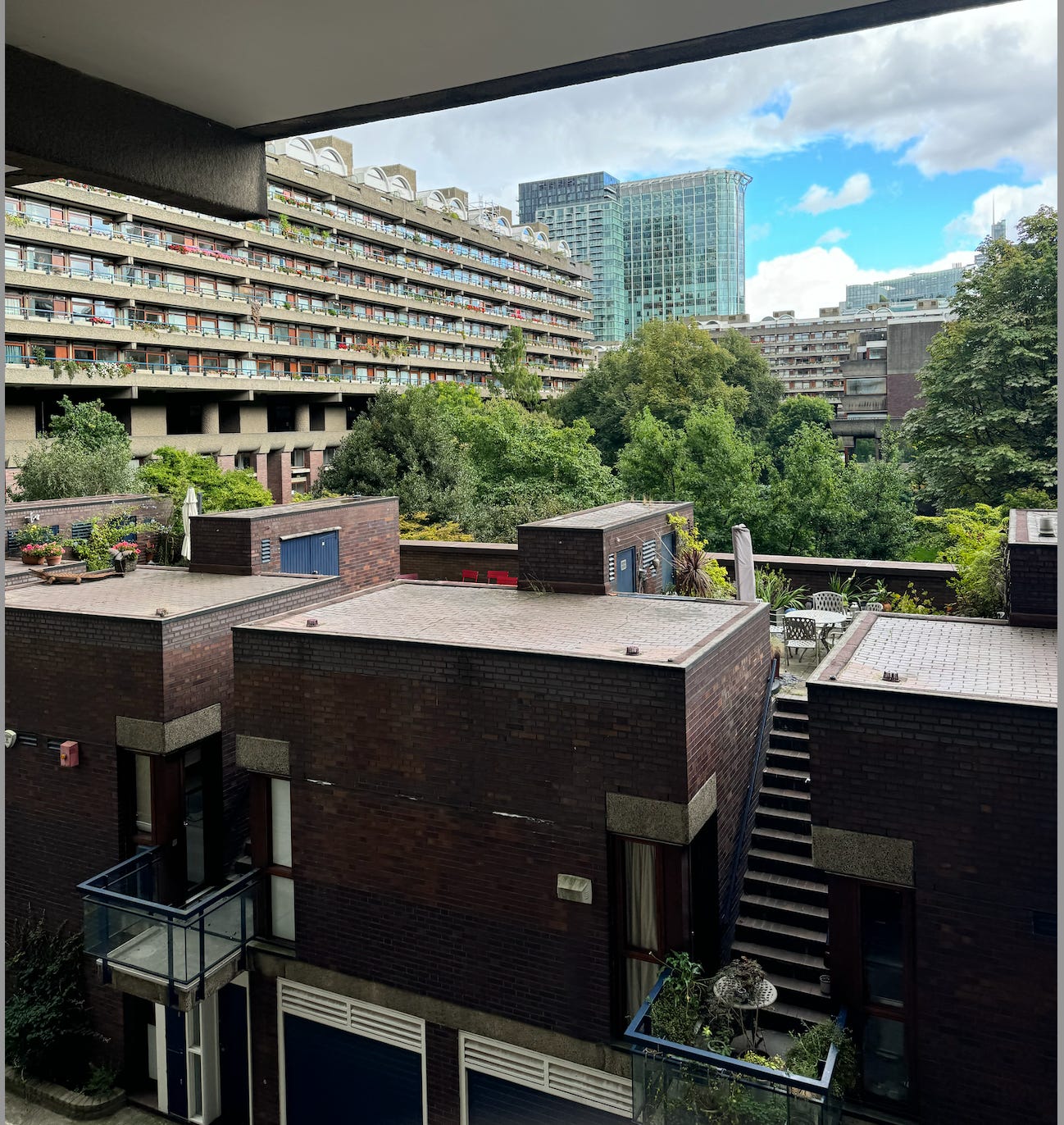
The tour isn’t bad. It lasts an hour and goes through most of the estate (some is gated to residents), and covers the tower blocks up close, gives decent views of the other terrace buildings and actual houses:
And sometimes the conservatory (if it’s open) and close-up looks at the concrete, discussions about them, and a mention of a barbershop (chicks only no fades), and walkways, ponds (not that deep, and dyed so they look deeper). And a skim of the construction test strip room (different grades of concrete and finishes) which is hidden away a parking lot. The tall buildings, called tower blocks… man… they are the Barbican’s calling card—they are something in photos and even better up close. The blocks have gondola-type flourishes and impose themselves on the skyline:
And there are smaller buildings, the horizontal terrace blocks that have colored railings, built-in plants, lighter-shaded, feels like, concrete… and which are reminiscent of Corbu’s L’Unité d'habitation in Marseille and other vague things Neapolitan or worker. There are the ponds and the big spread out horizontal cafe space adjoining it all…. chairs and tables everywhere. The tower blocks change shape depending on the angle they’re viewed from… as does, I suppose, everything, but here it’s very pronounced. From below the blocks are massive and imposing and broad, from a few hundred meters away they are light and thin spires. They seem bunched closely together but they’re not:
It is a wild XL portion of architecture, seeing all this, and even after doing the tour and sticking around I felt myself demanding more… more design, more stuff to look at. It was an overload but never too much—the details take work to see, or present themselves over space. And the beautiful stubborn directness of these buildings and materials fade, after a while, into an obvious background.
What one notices (and what’s pointed out) most on the tour is the extent to which the Barbican is elevated. Literally, as in above ground. There is the walkway—overpasses for pedestrians, crossing the buildings, with London street names that show up on the map. There are small bridges and balconies and lofted spaces, and many parts of the estate look over others. Most notable… or special, rather, to me, are the balconies on the blocks, curved and which jut out like gondolas. It is insane that they did this. Throughout… the color here and there (lots of yellow, some red and blue), the hardware, the balconies: small details riddled with Italian influence. Florence? Plus the ponds and cafe tables and curved walkways and plazas… and so throughout there is an incongruity here… concrete and air. Light and elevated… and yet brutalist… massive, immediate. The air in the estate, and the greenery, the water… the people… break up the simple “brutalist” tack this building has on it through pictures. We will call a building brutalist if it’s made from concrete and has some right angles. As for the Barbican—well, sure it is, on one level. It definitely looks brutalist from far away. But up close and inside there is more. Not just the scale, but the details… the lightness… this transcends definition. It’s a wild-ass set of positive Italian ideas made of concrete. It’s something to see these two rewarding design movements, the ostentation and directness, interacting… blending into something then new. Years later there is no tension here, just unity. A lot of it.
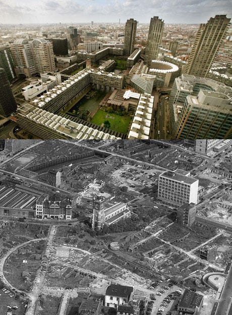
They began building this thing after the Blitz because the neighborhood there had been bombed badly (it was named Cripplegate?) and the extent of the damage of the Blitz was such that the City of London’s (little, central and old city inside London actual) tax base was depleted… and they had this land and wanted to make something special. Hence the big tower blocks. Chamberlin, Powell and Bon were the architects and it took like a couple of decades for them and the city (which owned it) to plan it and build:
And now the repairs. Will anything this… beautiful, on this scale will ever be built again? Probably not. Maybe in Dubai. But come on. More than that—who would pay for it? And where would it be? Moving on…
The tour said residents come first… the estate was built for them… and despite the prominence of the orchestras and restaurants and theater (and office buildings):
A good deal of the complex is not open to the public. For example the piazzas and ponds and plazas and easy chairs on the lower level… people just reading there on a Wednesday. And a barbershop—do I have to be a resident there to be a customer there? I didn’t get a good photo of it… and no one could answer my question. The scope and detail of the construction was such that the City of London Corporation owned it, like I said, and the fine print of that relationship meant it was legally a council flat—to to speak, public housing…
Video above of a modern British council flat with a perfect exterior.
This despite the tower blocks and terraces being marketed to… I suppose, downtown, city people. Bourgeois individuals with good jobs—high rents. And so the result was that, when, in 1980 or so, tenants in council flats received the right to buy their apartments… many of the folks who were renting at the Barbican did just that. As a result… not a lot of apartments to rent here these days, not as many as you would think in such a set of big buildings. Digging around—I read that common charges are high (makes sense since you’re paying for a whole neighborhood)… and that you can’t hang your washing (British for laundry) outside your window. Which way Western man? Life is full of important choices… there are rentals out there, £3,700 or so for a one bedroom, with fees… which is bananas.
If you need directions to the Barbican it is 22 minutes away from the Queen’s house by Lime bike, 15 minutes from Bob Hoskins’ character’s boat in The Long Good Friday (St Katharine Docks), a six-minute bike ride from the best cup of coffee I had in my life—Scotti’s in Clerkenwell Green:

The thing to get here is the chicken but Snake Super Health first principles shy away from monogastric animals It is 38 minutes from 384 King Road, which is an apartment Morrissey lived in once, and if you live in Stoke Newington it is about 35 minutes by public transit.
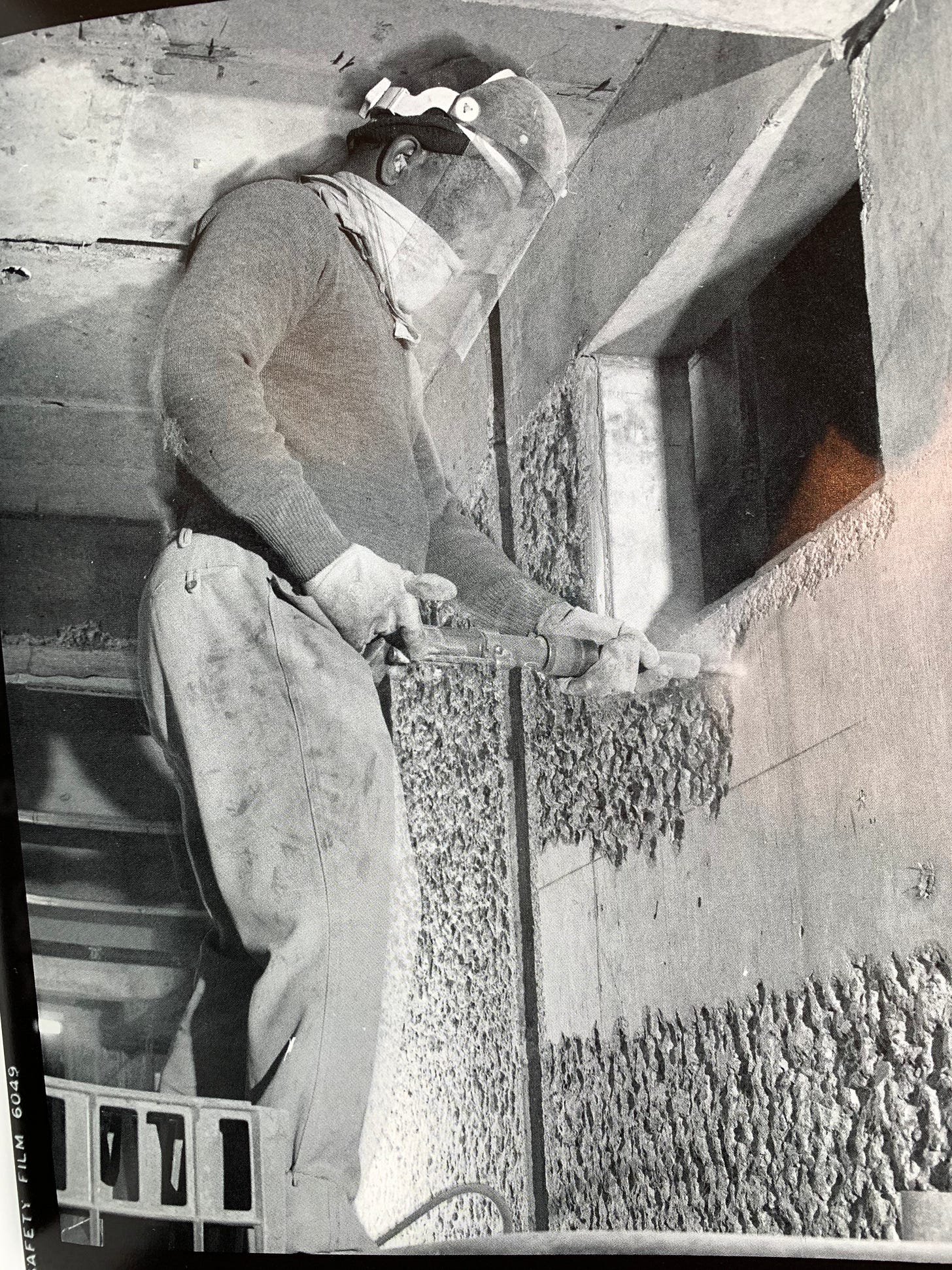
There’s a stippling/textured pattern on a lot of the concrete… the buildings moved over to rough concrete (as opposed to smooth) during the planning phase… the architects originally wanted smooth and with some marble… but rough concrete was more cost-effective… and Corbusier liked it. Workers pick-hammered the details by hand, in a sense, with this tool, which made it look how it did:
The pick-hammer was said to cause severe nerve damage and years later… neurological problems, things like that, worse. Brutal… Not much writing about this and a depressing legacy.
Someone was shooting a video right across from the terrace blocks, by a stairwell, behind the tour guide early into the tour.
I dug around for the rapper’s name but could not find it. He wore a knee-length white parka and red mask. It was sunny outside and in the mid 70s. You don’t need a permit to shoot there, and so there’s been a nice history of musicians filming their videos at the Barbican. My favorite is a late-career song by Saint Etienne:
And the best-known may be “Shutdown” by Skepta:
More on this playlist. I’m not sure what the first video shot at the estate was. Maybe “Ghost Town” by The Specials—which is a London architecture revue really, but the tower block is the video’s first shot.
It’s expensive to live in this place like I said, and I heard the ceilings in the apartments are low. You weigh that against the benefits that tenants and residents get from living there… access to the tennis and basketball court, a soccer field
And the aforementioned barbershop. It got me thinking. Not to get deep here—but one way the world works is that we organize ourselves around and strive towards physically small items that express real goals… discrete markers of accomplishment… years in school for paper, nights in the office for a set of keys… there is more to life than that, but sometimes that is all there is to work. Which is all right—what else are we going to do all day. The single-family homes in the Barbican… and the tenant-only barbershop in the complex. Together they had me to visualizing a new picture of success. No way I am renting out a tiny domicile for £3,700… and I probably have to be descended from George Best to get one of these houses. But they sometimes come up for sale. Wouldn’t that be nice, living in one of these houses, getting one of these sequestered haircuts. It’s like a Gramercy Park key but much better. It isn’t in America, which is a problem. But then we can’t be too detail oriented when looking at our real future.
My final thoughts here are informed by Gaetano Pesce, something he said when I interviewed him a couple years ago… I asked him why he worked with resin and so few others did, and he said:
A thousand years ago, people were working with wood, steel, stone… This stone, iron and metal in general—wood—today, they’re not witnesses of our time, but of another time. Today there is better material, more sophisticated [material], and the work we do with these materials is easier than with these old ones…
And then said that old shapes—“right angles, rectangular shapes, circles”—were “finished.” A criticism of how things are now based in futurist, optimistic ideals… which is the critical look at the Barbican, as a relic… a successful, hulking dinosaur enterprise from the past. Forget about the fact that this scale and freedom of expression won’t happen again. This thing is like Heaven’s Gate—it’s too big and too cumbersome. I like agreeing with Pesce, and in this sense I see the Barbican not as a piece of the past because of logistical reasons but because it is the final execution of concrete… on the grandest possible scale… a complete perfection of a so-called old material. There have been concrete buildings after this—big ones, even. And probably some big project somewhere by a state or someone with deep pockets and foresight. But no one else is improving on this thing.
Obs. 095:
10 things ending soon:
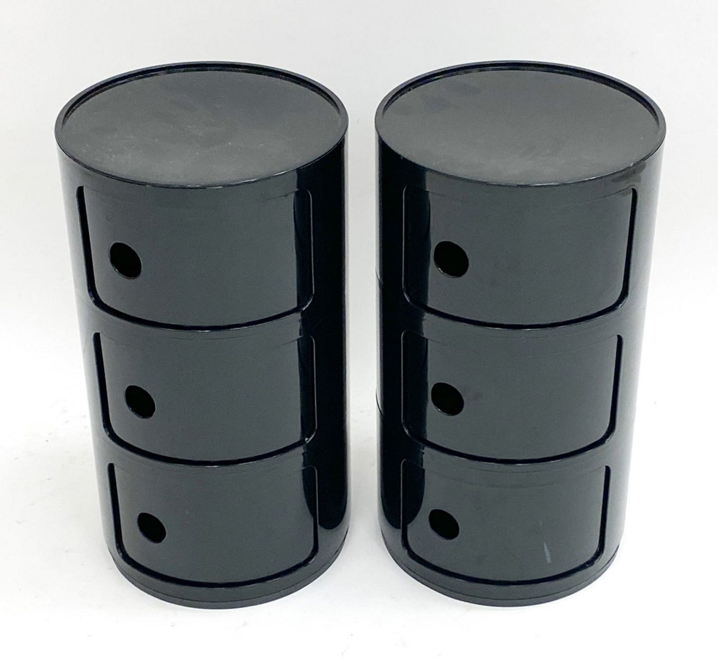
Castelli Componibili cabinets, Ct: Nice OGs with the homogenous bottoms… these run cheap lately, $1-200… I think the younger design people are over Italian or see these things as prohibitive… that is their loss, these are as timeless as jeans. The house, a Snake fav, has a number of sleeper hits, i.e. items without crossover designer names or provenance, including:
Lysberg, Hansen & Therp tables—two side tables, office dimension, harsh and brutal. No one likes Danish lately, their loss; cheap at $70
Insane pine frame here, no maker; looks great nude—it’s the base of a couch; this is more of a sculpture without the pillows $700
Norwegian ceramic service $50, very good deal, very beautiful; strong sconce for $60… minimal and red.
The Compos are $100… auctions are Tuesday
Sottsass accountant lamp, N.Y.ish: I write about this often but we rarely get a chance to see it—it’s such a subtle and held back design. Has the sort of power that emanates from a napkin sketch… have to imagine that Ettore, by the early 80s, was doing things that way then. These have run $500 min lately, often more—rightly… rightly so—and often sell in GBP. House has paper, like Sol Lewitt etchings (not by him); but to me the hits are the quilts— this one, in particular, is so good. $200 Wednesday
Below the wall: Investment-level Sottsass at a fair price a writing desk I need to see
build her crib around, deco tea-sets that I have never seen discussed or written about (invest in tea-sets… invest in tea), a $12,000 teakettle (worth a ponder)… a statement lamp from the 1930s that looks like it is from the future…Keep reading with a 7-day free trial
Subscribe to SNAKE to keep reading this post and get 7 days of free access to the full post archives.


