Q&A: Brook Hsu: Chairs as social practice (+ many auctions) (Observer 97)
Cesca Corbu Breuer Teak Italian... auctions... observed
Howdy y’all, talked to Brook Hsu about furniture… see her new work at Gladstone (64th St) tonight. Auctions down below—Observeer 97—Corbusier’s fav chair, Cescas (dirt cheap; great thatching), the second-best French mirror I have ever seen (after Pierre Cardin for Narciso), Breuer, a wild-ass tiny red office chair, many very fine rugs, Danish teak, modernist birch… other items…
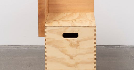
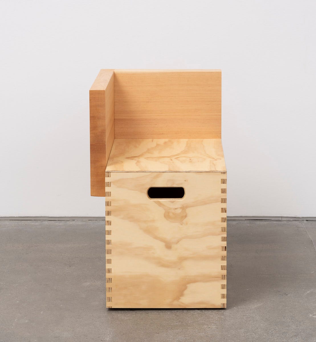
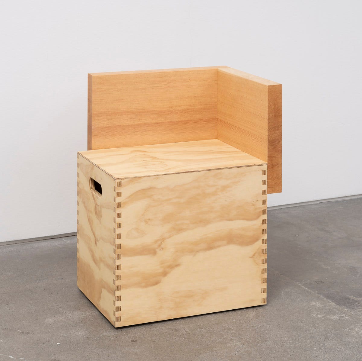
Brook Hsu’s work is precise and eternal. She used to paint on a collapsible table her dad built, and grew up in a house full of his homemade furniture: stools, benches, desks. Hsu built chairs for this show from wood, inspired by, a bit, vernacular furniture—old, Shaker-era, simple designs, made by amateurs—and, more specifically, the same precise and dialed in more modern wood pieces by Corbusier, Perriand. The chairs for the show (one above) are to sit in the corner of Gladstone Gallery’s 64th Street townhouse. That show opens tonight…. Sit in a chair, think about the art… it’s humane... I visited her studio in the spring and spoke to her about these topics and a couple others. Info on the show is here:
SNAKE: Can you tell me about the furniture you had at home growing up?
BROOK HSU: My dad made it, a lot is from before I was born, or right when I was born. It’s mostly made out of two-by-fours, or easily accessible lumber. Now they’ve aged and are orangeish, and are some of my most coveted furniture objects. More recently he made me a simple writing desk I have at home in my office. And my painting desk which I worked on for many years, my dad made. It was collapsible, because I was moving then. I still have it and painted on it until a few years ago. I also started making my own plywood furniture for my studio… (laughing)
What kind of stuff are you making here?
First thing I made—with my dad—were these plywood footstools which I used as a kid to get tall enough to see in the mirror. I would decorate them, I would draw on them, since I was a kid... I made one out of a cutting board in my 20s, and I use it in the bathroom. Then, these types of forms, footstools, as sculptures in earlier exhibitions. They were placed in a circle on the floor. There was a carpet there, too. Lately I’m trying to get a tabletop surface to paint on and work at—an easy desk that can be modular, and move from place to place, easily, frequently.
What inspired your dad to make the furniture? A practicality, a look?
I never asked him that specific question. I view him as a creator and designer—he’s a landscape architect and was doing household renovations, and, I’m assuming, was inspired to make things he was living with. One was a lack of availability of decent furniture in Eastern Washington, which is where we were at the time. And a love of designing things in his house.
He was a stay-at-home dad for the beginning of my life, then became a professor, and ran a print business, pre-Kinkos, out of our house. An early Mac user. And so the bookshelf I use now is one he built, designed to hold those old matrix printers.
Do you sit when you paint, and painting on a table?
I do, I also stand and work on the floor. The oldest part of my practice I do at a desk. I do small landscapes, mostly on wood, and have branched out from that… I work on the wall and on the floor, too, and got into the habit, in the past decade, of using cheap industrial carpets in my studio, because I’m always working on my knees. Initially the carpets were used for paintings. Now they’re a necessity, souping up water, easier on my knees.
The chair you’re making—can you tell me about it?
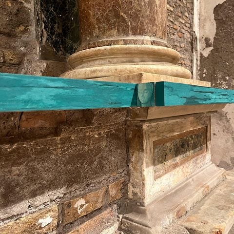
This is my second show and I’m more specific about making seating for the exhibition space out of a social practice belief that it’s nice to have an option for a place to sit and look at art. Generally it’s not provided in commercial gallery spaces. And I find that art viewing can be tiring, so getting to sit for a few seconds gives one more ability to take in what they’re looking at. The first thing I designed were benches, used in Rome for my show at Sant'Andrea de Scaphis. And here I designed a corner chair for the space in on 64th Street—it’s a townhouse, a really narrow space. It didn’t feel like it made sense to do a bench in the middle of the room as much as using the corner in the exhibit. I looked a lot at the work of Lina Bo Bardi, Le Corbusier and Charlotte Perriand, and the simple plywood and recycled wood pieces they made. I made a collage of them into a plywood box, with a wooden back on two sides, which provides an armrest and a space to lean on, if one wants.
Why are chairs not in galleries and in museums?
The model we use now, the white cube model, is the dominant model, is not very old. It’s designed around a gallery and seems more set up in service of the artwork and the artist’s vision [than a viewer’s comfort]. I would say these white cube spaces attempt to be neutral spaces, and including any kind of furniture may possibly take away from the idea that the space is neutral and a blank canvas for the artist to go and perform the vision they have. But it’s almost contradictory—I might be getting opinionated here—because art for art’s sake seems self defeating, because art is actually for people.
So… I just saw a new Mary Heilmann documentary, Waves, Roads, & Hallucinations, that Matt creed directed. I wasn’t familiar w her practice, moreso just her paintings, but she’s also been doing this for years, designing simple furniture for her gallery shows. Galleries don’t provide seating for artists to sit and look at art. Paul Klee wrote about this as well…
For the understanding of a picture, a chair is needed. Why a chair? To prevent the legs, as they tire, from interfering with the mind. (PK)
And so my general hope is, in the future, as people go to design new spaces, there are visions that artists have had that they can draw from. And it doesn’t have to be art—I’m trying to do this on top of what I do as a painter, and as an artist, just because I think it’s important. I think seating is important, and i think you’ve done features on seating that’s an artwork. Speaking to bodies, to energy…
Your work interacts with nature, the architectural spaces in which it’s presented, I’m thinking particularly of the Sant'Andrea show. Are the chairs for this show part of the space, or reacting to it?
Yes and no. I think, if I had more experience as a designer, I’d feel more confident saying yes, but it’s a side job right now, and so, i hope so. It comes out of this upbringing and with my dad and mom, who was a LA professor as well. And building gardens with them growing up, and understanding that those spaces—and LA’s overall pedagogy is more holistic—focused on the overall well-being of the people, because gardens provide repose and play for us. But also they provide the ability to sustain plants and wildlife, and the whole landscape, both man made and natural features.
That ethos is how I’ve always approached exhibition design, and, maybe, given more, time it would evolve. Maybe in 20 years and I’m still stubbornly trying to design seating, these chairs would be more refined, and would communicate more with the spaces that they’re intended for. Right now they feel kind of crude, and I’m trying to be more accepting of that.
Is a crude chair as much of a chair?
I think so. The stuff my dad designed was vernacular, and it’s not like he studied furniture design—and neither have I—and vernacular furniture is very sophisticated in and of itself. But it also feels like itself when it’s in its vernacular setting. Some of this feels uprooted from my childhood home and put into a gallery. Chairs that feel more at home at my place, than a gallery space.
Part of the process has been more collaborative to make this chair, and a set of frames for the artworks. I was more involved than I imagined—we need the wood grain to go this way, and there’s subtle touches that we did, regarding the joinery—we had to pick out the dowel size, stuff like that; we made some finger joints on the sides and we were adjusting the hand-hole for pickup, and the armrest and back are a ledge—that were part of the discussion. It was really nice and it made for a much more in-depth experience.
How are your chairs different than your dad’s furniture?
I don’t think my dad’s ever built a chair. He made a few benches in our garden, wood fashioned to large stones, the wood painted green. The furniture he designed in my childhood was outdoor furnite. The two iterations I’ve done are a bit cleaner—his stuff was so expressive. I’ve toned some of that down for this exhibition furniture, and I haven’t made them by hand, like he did. I work with a woodworker, and he does everything himself and he hasn’t studied woodworking himself. And so there’s always a feeling of discovery in every piece he makes, and it’s made in a fury of inspiration—the designs tend to have really good proportions—he’ll cut the edges off of a two-by-four, so its slanted, or will include dowels on a spare piece of wood. A lot of times it’s off scraps, since doesn’t have money—it’s scrap wood furniture. They have a collaged feeling to them, too.
Are you moved by design and if so what might do it?
Yeah, I am moved by it. And on the other end, I am perturbed by it, too. And there are a lot of things that we see everyday, where I’m like, “God…”
I’m pretty sensitive with respect to the objects I keep in my life, and around me. I have an appreciation for beautiful things, and I love the view you take on, writing about furniture, because you look at a lot of things. Regarding curated Instagram accounts - expensive stuff, all the stuff is super unattainable, and a lot of stuff out there is super attainable, and is very attainable if one makes it themselves. Sometimes I think what I feel about the stuff my dad makes is that it embraces that belief.
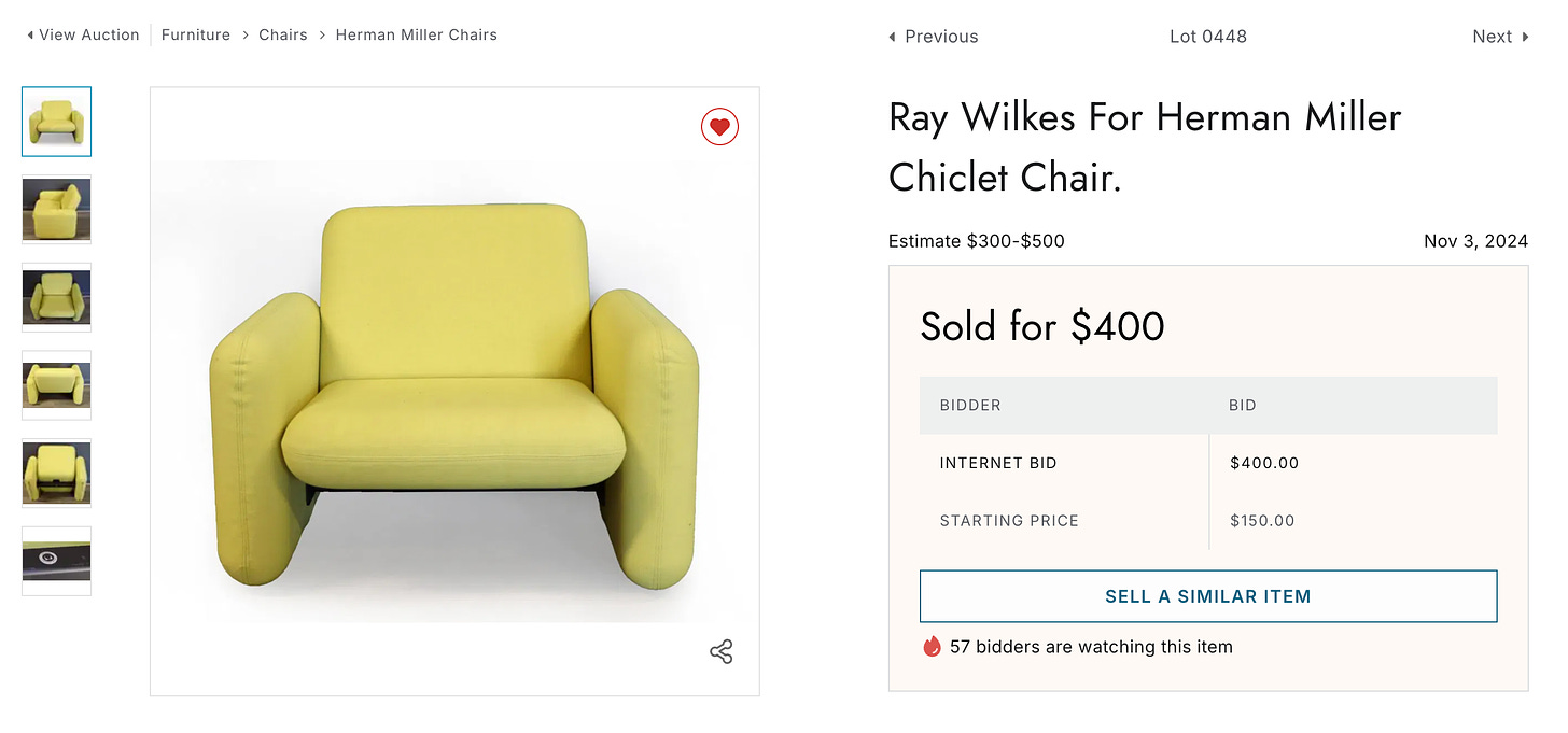
Price values from this past weekend:
Best deal is above. Other great deals on auctions I wrote about last week for paying subscribers: Bellini cab chairs pair $1,500 (fair); Saarinen marble top Tulip $850; Warren McKenzie glazed stoneware plate set, $400 (really good); Perriand-style colorful wall unit $3K; French modern beech desk $600 (huge deal, wild lines); Felicerossi pair swivel club chairs $900 (fine deal); Kita Tok lounger $850 (come on); Vuitton vachetta 80s tote $350 (deal duh); Vuitton Boston bag with the good zippers $600 (mamma mia); Ferragamo Gancio bag $250 (not my beat but seems cheap); pair orange enameled mushroom lamps $500 (solid); Kilm carpet with hand knots $250; Vuitton ‘80s garment bag (suits) $400; Mislisted “Knoll” Eames lounger $3,400 (whoopsy daisy); Legnomania candlesticks (no one bought these…)
Obs 097
Austin, Friday:
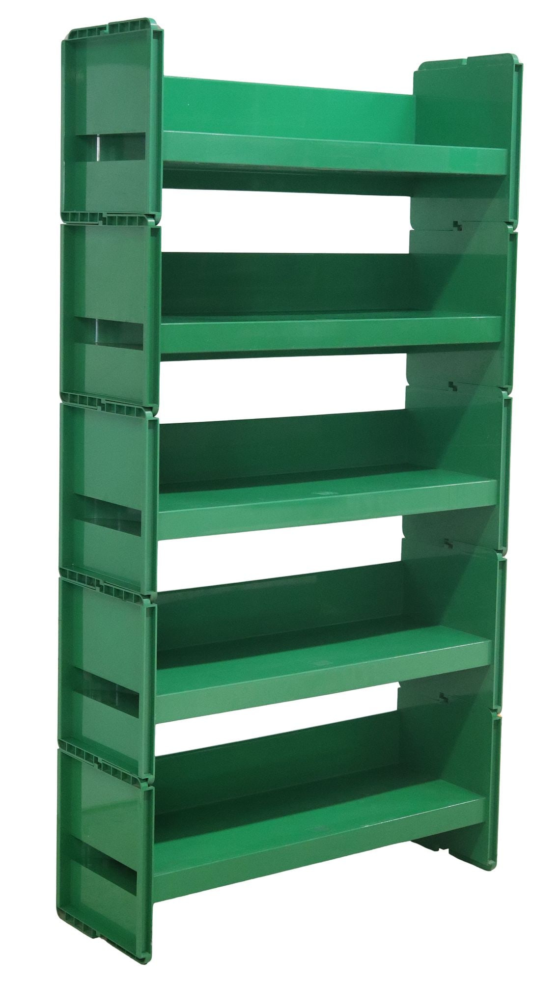
Jeep modular bookshelf by De Pas, D’Urbino, Lomazzo, $200: Ends Friday morning… One of the all-time perfect pieces of Italian design, in league with the Componibili and the Boby trolley but has fallen behind (both in terms of discussion and price) due to… I think… a lack of reissues. Those two pieces were not always in production but they mostly have been; this one, a peer (1970s; can’t find a specific year) during release… is just harder to get… you need the originals… and so it, over the past half decade, has… not receded from view, but has not climbed up the ladder like the other two. A shame? Hard to say. One of the biggest ass-beaters out there. Also happily on the same chromatic theme with Hsu’s work, which is nice for this letter. No real price, simply never sells in America.
House doesn’t have much else; some Saarinen office chairs for $200; ripoff Tomado shelving (in Colbo colors) for $300; a very regal and simple Afdal for Bruksbo sideboard ($850); some rugs
New Orleans, Saturday:
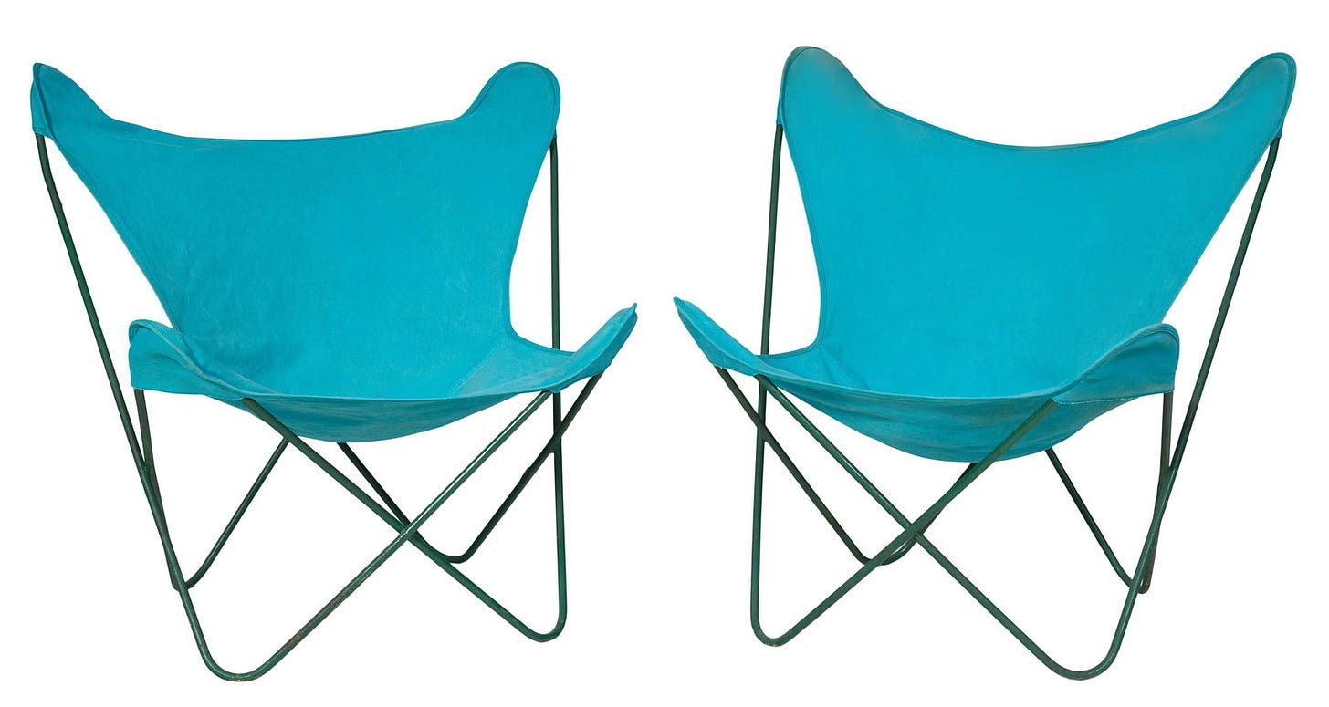
Ferrari for Knoll Hardoy chairs, pair, $200: Effectively the bizarro Ny chair; this one works because it’s in a loud… gaudy… unnatural color. Few designers played with this teal colorway… very few. It wasn’t used hard in the 1970s… there are instances, of course… in paintings, Tiffany’s, the odd, older Danish sofa, some items by Pearsall… the best thing I saw digging around was this 1970s one by Milo Baughman… chrome… exhausted cushions… width and depth… just the best. Anyways Jorge Ferrari was an architect and city planner… this one’s from 1938 (amazing)… the better versions are odd-colored ones and the occasionals that show up in leather. These solidly sell under $500 lately.
House has this Rohde-style room divider (looks Pagan) for $300, rugs, lots of detritus.
Below jump: everything mentioned above which has not been written about. Enough deals to sink a steamship. Thanks…
St. Louis, Saturday:
Keep reading with a 7-day free trial
Subscribe to SNAKE to keep reading this post and get 7 days of free access to the full post archives.

